



Unlocking the Power of Data Visualisation in Business Intelligence


In business intelligence (BI), data visualisation is how raw data becomes something decision-makers can read: charts, maps and dashboards instead of tables and exports.
Large volumes of raw, unstructured data are hard to analyse in a table. A chart makes trends, patterns and outliers visible at a glance.
This article covers the building blocks of BI, what visualisation adds, the most common chart types, the tools our analysts use and eight practical guidelines.
The basics of BI
Business intelligence refers to the processes, methods, and technologies used to collect, integrate, analyse, and present business information. BI aims to help organisations make better business decisions by providing insights into their operations' past, present, and future performance.
A BI system pulls data from internal systems, external databases and social media, and analyses it for patterns in customer behaviour and market trends.
A BI setup usually has five components: data integration, data warehousing, data mining, data visualisation and reporting.
Data integration
Data integration collects data from multiple sources into a single database or data warehouse, so figures from different departments can be analysed together.
Data warehousing
Data warehousing involves storing and organising data in a central repository, which BI tools and applications can access.
Data mining
Data mining uses statistical algorithms and machine learning to find patterns, trends and correlations that simple reports do not show.
Data visualisation
Data visualisation presents data as charts, graphs, maps and dashboards, so users can spot trends and patterns without reading raw numbers.
Reporting
Reporting delivers the results to decision-makers across the organisation as dashboards, scorecards or ad-hoc reports, tailored to what each stakeholder needs.
Why BI matters
BI gives managers a shared, up-to-date view of how the business is performing, which makes it easier to spot problems and decide where to act.
The rest of this article focuses on data visualisation, the BI component most users see and work with.
Advantages of data visualisation
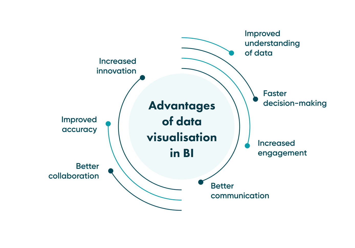
Improved understanding of data
Users who are not data analysts can still read a chart. Trends, patterns and outliers that are hard to spot in a spreadsheet become obvious in a graph.
Faster decision-making
When a trend is visible at a glance, nobody has to wait for an analyst to interpret a report. That matters most where prices, stock levels or demand change daily.
Increased engagement
A BI tool only pays off if people use it. Clear, readable charts make that more likely than tables of figures.
Better communication
A chart is easier to present to stakeholders and decision-makers than a table: it shows the key point in one view.
Better collaboration
A shared dashboard gives a team one version of the figures to discuss and interpret together.
Improved accuracy
Errors and outliers stand out in a chart. A spike or a gap that is easy to miss in a spreadsheet is hard to miss on a line graph.
Increased innovation
Looking at data from a new angle, for example by region or customer segment, can reveal trends nobody was looking for and suggest new ideas.
How data visualisation plays into software development
Visualisation tools also help during web and mobile app development, in three ways.
Testing and optimisation
Charts of test results and performance metrics show developers where the software is slow or failing, and whether a change made it better.
Monitoring and troubleshooting
Monitoring dashboards show response times, error rates and load as they happen, so developers can spot anomalies early and fix them.
Enhancing user experience
Charts of user behaviour, such as funnels and session data, show how people use the product and where they drop off. That tells the team which screens to improve first.
For a consultation on your project, contact Go Wombat.
Data visualisation types
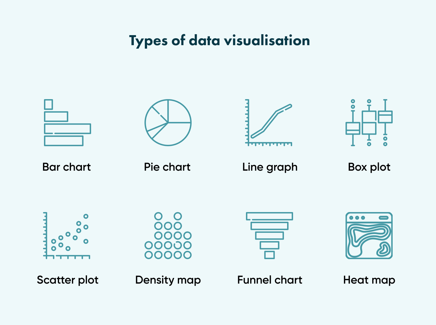
These are the chart types used most often in BI.
Bar chart
A bar chart is the basic way to compare values across categories, which is why it is so common on BI dashboards. Bars can be grouped or stacked to show the split across market segments or subcategories. Horizontal bar charts work better when category labels are long.
Pie chart
A pie chart is a circle divided into sectors. The size of each sector is proportional to the value it represents, and together the sectors add up to 100%.
Pie charts show the composition of a single data set, such as revenue by product line, and are common in marketing and sales reports.
They work for a handful of categories. For many categories, or for comparing values across several variables, a bar chart is usually clearer.
Line graph
A line graph shows how a value changes over time, with time on the horizontal axis. It can be combined with a bar chart to show two measures in one view.
Box plot
A box plot summarises a distribution through its quartiles and can be drawn horizontally or vertically. The box runs from the first to the third quartile, with a line at the median. The whiskers extend either to the minimum and maximum values or to 1.5 times the interquartile range, with outliers shown as separate points.
Box plots are useful for comparing how values are spread across several groups.
Scatter plot
A scatter plot places each item as a dot on X and Y axes, so its position shows two of its values at once. It is the standard way to check whether two variables are related.
Dot map/density map
A dot map places data on a map to show it in its geographical context. Each dot marks the location of one item, such as a shop, or a group of items in one area.
This format makes density easy to see, but it does not give precise numbers.
Funnel charts
A funnel chart shows how a value decreases from one stage of a process to the next, for example from website visits to sign-ups to purchases. Each stage is drawn as a narrower band, often in its own colour.
Heat maps
A heat map uses colour to show the size of a value in two dimensions. Changes in hue or intensity show where values cluster and how they vary.
There are 2 main types of heat maps: cluster heat maps and spatial heat maps.
In a cluster heat map, magnitudes are arranged into a matrix with fixed-cell size, where the rows and columns represent discrete phenomena and categories.
A spatial heat map uses colour to represent the density or distribution of a phenomenon across a geographical area. It displays data in a map format, where the intensity of the colour is proportional to the frequency or magnitude of the occurrence in that particular region.
Data visualisation tools
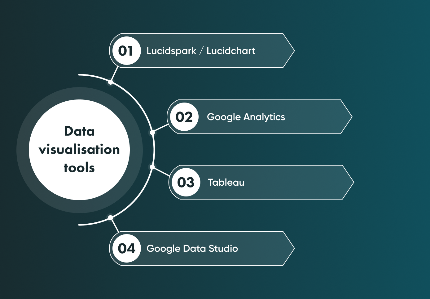
These are the tools our business analysts use most during the discovery phase. Lucidspark and Lucidchart are for whiteboarding and diagrams; Google Analytics, Tableau and Google Data Studio are for analysing and charting data.
Lucidspark/Lucidchart
Lucidspark and Lucidchart are cloud-based tools from Lucid. Both support real-time editing, comments and access control.
Lucidspark
Lucidspark is a virtual whiteboard for brainstorming, with sticky notes, freehand drawing, templates, voting on ideas and integrations with other collaboration tools.
Lucidchart
Lucidchart is a web-based app for flowcharts and other diagrams, with templates and shapes for business, engineering and education. It integrates with Google Drive, Dropbox and Slack and supports data linking and publishing.
Google Analytics
At Go Wombat, we also use Google Analytics on client projects to track website traffic and user behaviour. It has built-in line graphs, pie charts and tables, but it is not designed for building custom charts.
For that, its data can be exported to or connected with tools such as Google Data Studio or Tableau, which build more advanced, interactive charts of a website's performance.
Tableau
Tableau is one of the most popular data visualisation tools. It offers drag-and-drop chart building, interactive dashboards and real-time analytics.
Google Data Studio
Google Data Studio is Google's free tool for interactive reports and dashboards. It connects to Google Analytics, Google Sheets and many other data sources, and its reports can be shared with stakeholders.
Primary data visualisation techniques and practices
\#1. Define your goals
Decide what question the chart should answer before you build it. That tells you which data to include and which to leave out.
\#2. Keep it simple
Leave out anything that does not help the reader, such as decorative elements or data that is not needed for the main point.
\#3. Choose the correct type of visualisation
Use line graphs for change over time, bar charts for comparing categories, scatter plots for relationships and maps for location. The wrong chart type hides the point.
\#4. Use colour and contrast wisely
Use colour to highlight the one or two things the reader should notice, and keep everything else neutral.
\#5. Provide context
Add clear titles, axis labels, units and short annotations so readers interpret the data correctly.
\#6. Make it interactive
Filters, hover-over details and drill-down let users explore the data themselves instead of asking for a new report.
\#7. Test and refine
Check with users whether a dashboard answers their questions, and review it regularly as goals and data change.
\#8. Ensure accessibility
Make charts readable for everyone: enough contrast, labels that do not rely on colour alone, and an alternative format, such as a table, for users with visual impairments.
Summing up
Good charts depend on accurate, reliable data and on people who understand both the tools and the analysis.
Go Wombat can build custom visualisation tools or integrate existing BI solutions into your software.
Contact Go Wombat to discuss your project.
FAQ
Why is data visualisation important in business intelligence?
Visualising data in business intelligence makes it easier to understand, speeds up decisions, improves communication and collaboration, makes errors easier to spot and can reveal new trends.
What are the main goals of data visualisation?
The main goals of data visualisation are:
- To make complex data quick and easy to understand.
- To support decisions based on data analysis.
- To present insights and trends clearly to stakeholders.
- To reveal patterns, relationships and outliers that other formats hide.
- To show opportunities and areas for improvement.
- To make data easier to present and discuss.
What are data visualisation examples for business?
The most common types in business are bar charts, pie charts, line graphs, box plots, scatter plots, dot maps, funnel charts and heat maps.
Share and subscribe to our blog
Related articles

Why Is the Digital Twin of an Oil Refinery the Most Complex AI System You Will Ever Build?
Why a digital twin of an oil refinery is so hard to build: seven interdependent layers from physics simulation to control system integration, results from Cosmo Oil's refinery digital twin, a look at Honeywell's planned digital-twin work at the Dangote refinery, team and data prerequisites, and why projects fail.

How RAG Helps AdTech Platforms Reduce Campaign Data Hallucinations
RAG helps AdTech platforms reduce AI hallucinations by grounding outputs in real campaign data, making reporting, attribution and recommendations more accurate and auditable.

How Do You Achieve ISO 27001 Certification When Your Infrastructure Runs AI Agents?
ISO 27001 is the international standard for information security management systems (ISMS).

How can we help you?

